My Client's Site Ran on Tables and a Hit Counter for a Month. The Results Embarrassed Me.
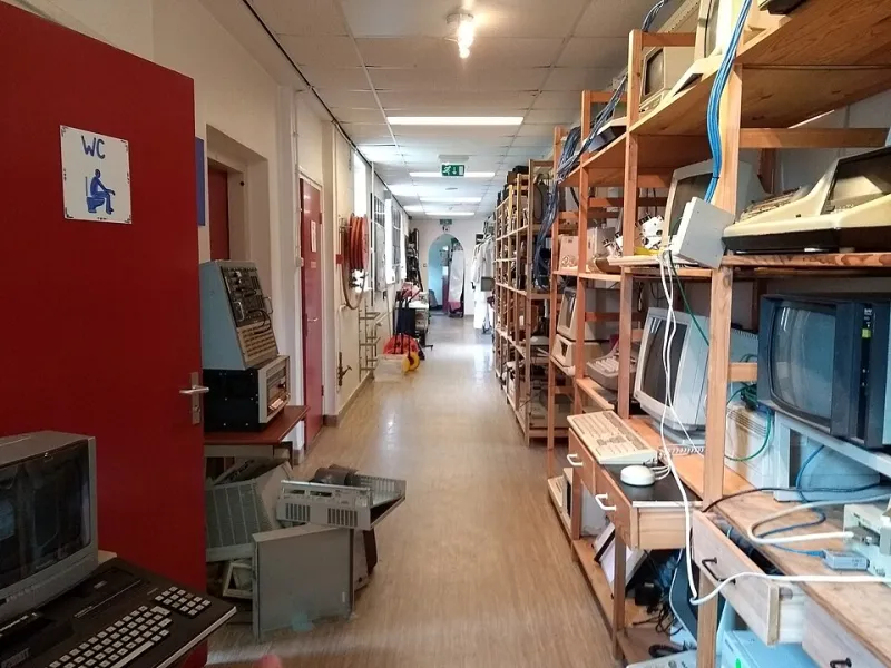
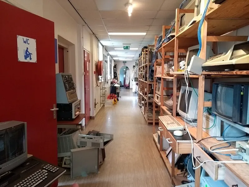
Photo: jmerelo, CC BY-SA 2.0, via Wikimedia Commons
The Rules I Set For Myself
A friend of mine runs a bike repair shop in Columbus and needed a website. Instead of reaching for the usual stack, I made a bet: I'd build it like it was 1996 and see if anyone actually noticed or cared. The constraints were strict.
- HTML 3.2-era markup only — table-based layouts,
<font>tags, the works - Zero JavaScript. Not "minimal." Zero.
- One animated GIF (a spinning wrench, obviously)
- A visitor counter at the bottom, because it was legally required by the laws of 1996
- No responsive design. If you were on a phone, you scrolled horizontally like a pioneer
Then, because I'm a glutton for data, I built a second version of the same site — same copy, same services, same contact info — with a modern framework, responsive layout, and all the trimmings. I split traffic between the two and waited.
Week One: The Sound of Silence
The first thing I learned is that nobody complains about a website that loads instantly. The 1996 version weighed 14 kilobytes total. Fourteen. The modern twin, with its hero image, web fonts, and analytics bundle, came in at 1.8 megabytes.
On a decent connection, that difference is invisible. On the bus, on a throttled plan, on the cheap Android phone half the shop's customers carry — it is not.
The Numbers Nobody Expected
After 30 days and about 3,400 sessions split between the two, here's what shook out:
- Bounce rate: 38% on the retro site vs. 44% on the modern one. I expected this to go the other way.
- Contact form completions: Nearly identical. Turns out a form is a form, whether or not there's a floating validation tooltip.
- Load time on 3G: 0.4 seconds vs. 6.1 seconds. This is the whole story, honestly.
- Accessibility score: The table-layout site, run through a screen reader, was actually... fine? Semantic HTML from 1996 is still semantic HTML. The modern site had ARIA labels pasted over div soup and did worse.
The one metric the old site lost badly: mobile sessions. People on phones bounced hard from the retro version, and I don't blame them. Horizontal scrolling to find a phone number is a special kind of 1996 punishment.
Who Complained
Exactly one person: a prospective employee who emailed to say the site "looked like a scam." That's the branding cost of nostalgia — a certain slice of visitors equates modern polish with legitimacy, and no load-time stat will convince them otherwise. For a business, that perception is real money whether it's fair or not.
Who Loved It
Everyone over 40 who noticed, basically. Three separate customers mentioned the site "reminded them of the old internet" in the best way. The hit counter — which I fessed up to faking the number on — got more genuine affection than any feature I've ever shipped. People wanted to know if they were visitor number 2,047. (They were. I never reset it.)
What I Actually Believe Now
I went into this expecting to write a smug piece about how modern conventions are developer vanity. I'm leaving more conflicted. The retro site won on speed and lost on mobile, and mobile is where the customers are. The lesson isn't "build like it's 1996." It's that most of what we ship in 2025 isn't serving users either — it's serving frameworks, design trends, and analytics dashboards.
The bike shop kept the modern site. But I stripped 900 kilobytes out of it, killed three JavaScript libraries, and yes — added a hit counter to the footer. It's still there. It's at 11,206. Nobody has complained yet.